UX oF UX Portfolio
Principles used: 8

Curiosity Gap
Curiosity gap comes from the missing piece of information. When we don't have the info, which we want to know, our brain just gets eager to know what's lying behind those curtains
Example: Google pay can directed show us the rewards, it can be quick, requires less efforts from user and is time saving. But why do they hide that info? and why do they make us scratch the card & then reveal us the same info
To create a suspense, to trigger a sense curiosity in human mind which hits dopamine release when resolved.


Mental Model, Discoverability, Constraint & Feedback
It's story time, so, when I gave this portfolio link to 2 of my friends to give me feedback, one of them asked - "how does it open? I tried clicking on it center circle several times, but it's not opening"
And that's when I realized, I forgot that people have different mental models for everything (Mental model simply means, a person's interpretation of how something will work)
Now, since users can think - it opens by clicking,
so I need to use feedback to tell users - it open by scrolling. So, I used the change in cursor's color from white to red, (red as it's standard color for error state) as an indicator of constraint that would communicate - it's not to be clicked..
But even after constraint signifier, how would users discover that it open by scrolling?
Well I had to prefer usability over aesthetics. So finally, I added a message in an alternate cursor state, saying "scroll down" when hovered over the center circle. It removed all confused and made discoverability easier.
Social Proof
Whenever you come across a situation that is ambiguous or when you are unsure whether to trust or not,
it's a short cut for your brain -
to take decisions easily,
save time and energy,
avoid confusion and ambiguity,
reduce risk of financial losses by avoiding unfamiliar option.
by simply looking at what others are choosing.

Gestalt's law, Cognitive biases & Fundamental design principles
Use of Gestalt's law like -
Law of Proximity,
Law of Common region &
Law of Similarity,
was made along with basic design principles of -
Repetition,
Contrast,
Consistency &
Hierarchy.
as well as cognitive biases like -
Chunking,
Progressive disclosure,
Familiarity Bias &
Fitts's Law.

Peak-End Rule, Serial Position Effect, Sensory Appeal & Delighters
People judge an experience by its peak and how it ends.
People remember more unexpected and playful pleasures
It's easier for users to recall the first and last items of a list
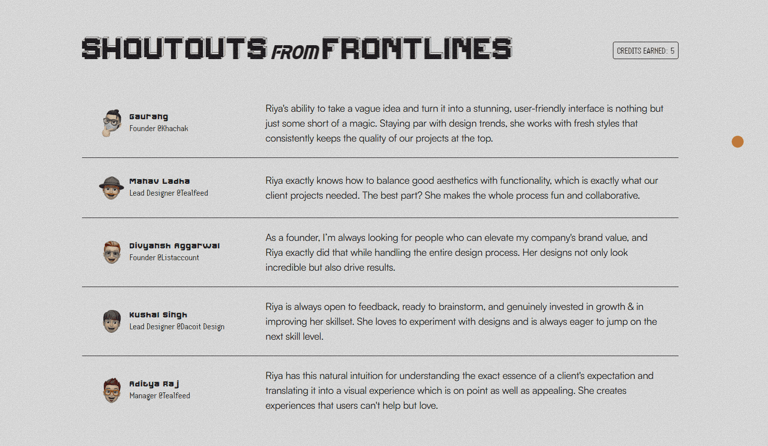
Riya exactly knows how to balance good aesthetics with functionality, which is exactly what our client projects needed. The best part? She makes the whole process fun and collaborative.
Hawthorne Effect
Users change their behavior when they know they are being observed
Skeuomorphism
Users adapt more easily to things that look like real-world objects
Familiarity Bias
People prefer familiar experiences
Reactance
Users are less likely to adopt a behavior when they feel forced
Peak-End Rule
People judge an experience by its peak and how it ends.
Sensory Appeal
Users engage more with things appealing to multiple senses
Chunking
People remember grouped information better
Delighters
People remember more unexpected and playful pleasures
Serial Position Effect
It's easier for users to recall the first and last items of a list
Law of Similarity
Users perceive a relationship between elements that look similar
Social Proof
Users adapt their behaviors based on what others do
Juxtaposition
Elements that are close and similar are perceived as a single unit
Law of Proximity
Elements close to each other are usually considered related
Visual Hierarchy
The order in which people perceive what they see